
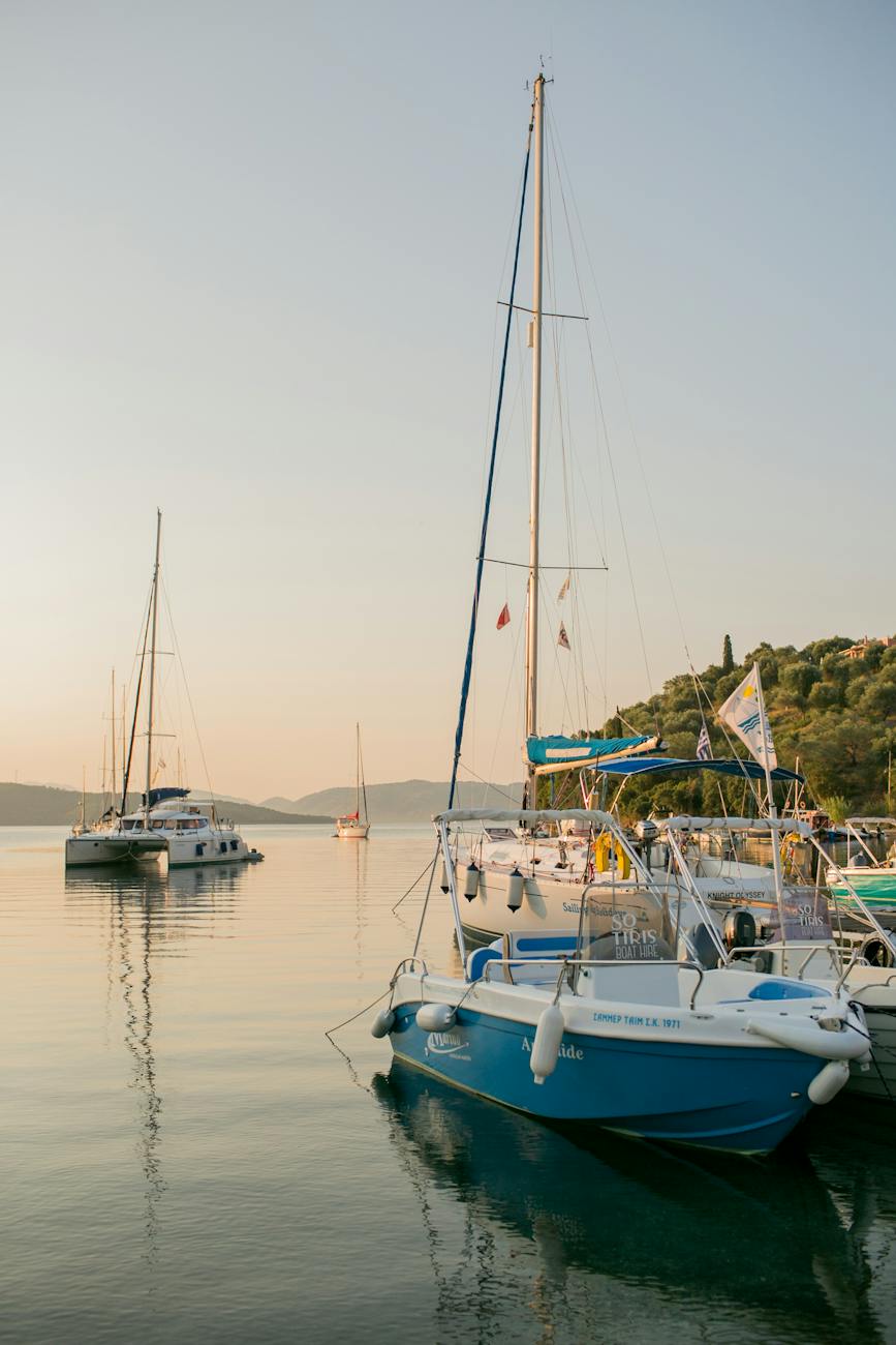
If one were to look at any 24-hour period of time, one could consider it as live theatre, each time of the day an act of a play, complete in itself whilst contributing to the story. From night to dawn, midday to evening, each act of the movement of time plays into that day. The seventh act would be considered Twilight, when the sun is no longer visible, sunset is complete and a veil of light comes softly to reveal the night. The colours of Twilight fall into three categories; nautical, civil (or urban), and astronomical. This colour palette is a beautiful reveal prior to the drama of the night.
There is a scientific reason why the light changes like this before the dark, our purposes are not to analyse but rather to use it as a muse and a base for this year’s creative purposes. The light is fading from the day much like a veil lifting the next scene, the deep colours of nature, like the greens of the trees or the rocks on the mountains, letting go of their last colour for the night as they turn dark. The dark hues become the darkest blue, the darkest green and a deep slate grey. The lighter colours are not ice or pastels like we see in the dawn, they are subtle, becoming pale before the light is gone.
These palettes are readily available online, depending on which palette appeals to you. The nautical makes good use of the creams and blues with a hint of red flashing across the sky as the last sunset disappears for the night. Likewise, the astronomical lights are the veils of soft sparkling lights against a deep blue backdrop with a hint of the cream.
For these purposes and in keeping with the twilight theme, finding the palette that works is the first step. The second would be fabrics, luscious velvets that hold a depth of colour or a light sheer veil to give that cream sheerness or even hold that light splash of astronomical lights, with a third choice would be the nautical with the splash of red. A mood board, either on a tablet or a folder would be the beginning of styling the look or client.
Summary
The three categories for twilight palette inspiration;
- Nautical
- Astronomical
- Civil
A mood board to form the base to the look with that inspiration.
Thirdly, give yourself some space to reflect on the movement of light and the mood it creates in those last 15 minutes of the day. Twilight in an urban setting is very different to an oceanic view. In the city, the night light slowly comes through and the lights of the streets begin to come on and twinkle, they are in contrast to the silver of most light poles that they perch on. Giving yourself that 15 minutes over the next few days will provide you with a new understanding of light and the mood that it creates.
Take advantage of Part 2 tomorrow as we look at fabrics and how to use them. This is a 4-part series and will provide links to extra information were needed.
As a bonus, this song by Enya might bring some inspiration with the moment, along with some beverage. Whatever helps you to take in that moment of time, does help that creative journey.
Further Reading
To avoid confusion, I’ll keep updating this section this week whilst adding the styling, makeup, and accessories articles. Whether it’s for personal or professional use, it is worthwhile to keep swatches, either digital or a hardcopy or even both, of looks you like with what swatches. You might wear different swatches for working out, going to the supermarket or a night out on the town. This is about building a portfolio and we will cover as much as possible this week. Primarily, these colours are unique for an evening look.
The Twilight palette is not about black, it’s the changing of colour before night sets in.
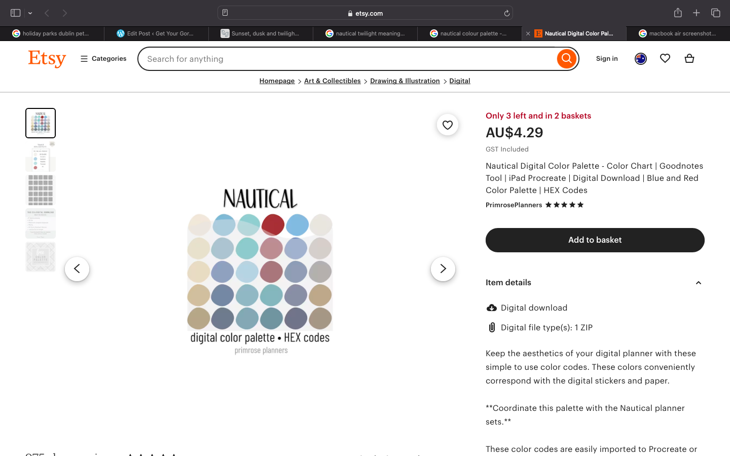
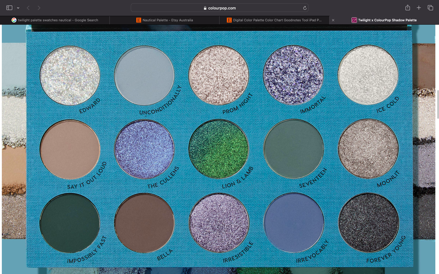
The makeup palette is a good selection of pigments for an urban look, and I would add a deep blue to that, too. 2 of these palettes are available on Etsy as a download. Links are below;
